Improving icon discoverability with good language
This short story is about how we improved the experience of finding the right icons for our digital products.
About me
My name is Luke Ylias (Ya-lie-is). I am a User Experience Designer based in Newcastle, Australia. Working with amazing people at Greater Bank.
I'm passionate about innovating on design tools and systems that help empower teams create quality products.
Intro
Icons are essential visual design elements of any application. They help contextualise content or functionality. Furthermore, due to their recognisable nature, they should be easily understood at a glance.
At the beginning of our project, we sourced an icon library consisting of three different weights. The icons cover various types, which is ideal in a banking app with many tasks a customer can do.
The problem we ran into was over time. We shifted between design tools and new developer domains were set up with no straightforward process around how to use and implement icons. It meant current and new designers and developers had no standard to refer to.
I want to share a small project I worked on with our fantastic content designer jenny to improve the consistency and discoverability of our icons.
Problems
The current icon naming convention makes it hard to find available icons.
Icons have inconsistent sizing, which leads to a visually less coherent app.
Icons sourced from different libraries (some icons are from various kits with different stroke weights).
Developers hardcoding icon sizes, making it difficult to manage long-term.
Watch points
The marketing team uses the icons, and their current naming for the marketing website, so we will need to communicate any changes made.
Learning the current process
Tackling the first problem of discoverability. It was essential to understand how designers were searching for icons. We discovered two different workflows happening.
Firstly, designers, we're:
Copying in a Figma component with an instance of an icon
Detaching that component instance
Then swapping the icon instance using the search variants panel.
Secondly, designers would use the search field in the assets tab, typing in a name they thought captured the icon.
It was fascinating because the complexity of the icon naming went against other mental models designers used when searching for icons.
For example, we have this icon called "rename".
However, you might search for "pen" or "pencil". This led us to rename icons based on what they are rather than what they do.
But "rename" still has its place. Remember, we want to improve discoverability and the more we can accommodate the different mental models being used, the better.
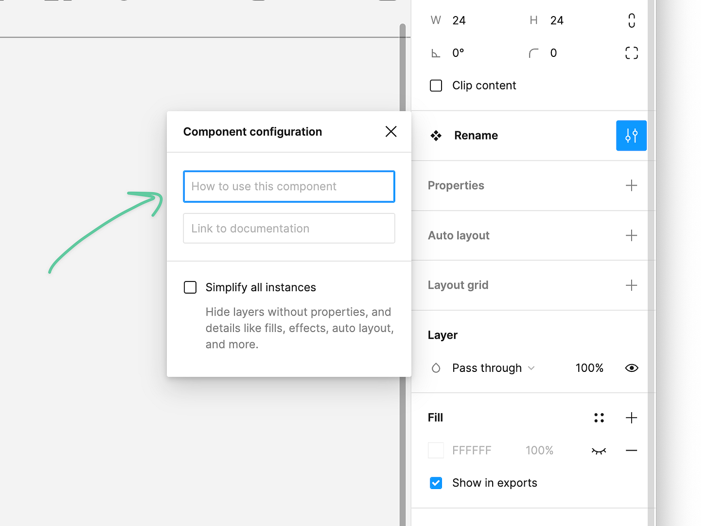
We could use Figma's component descriptions to hold additional metadata. For example, the content we put into this field would appear in searches, meaning if you search "Pen" or "Rename", the same icon would show.

Auditing and renaming icons
After learning how icons were currently being used, the following steps were auditing the icon Figma kit.
I would review the icons, ensuring they were from our original kits and find suitable replacements for icons that weren't.
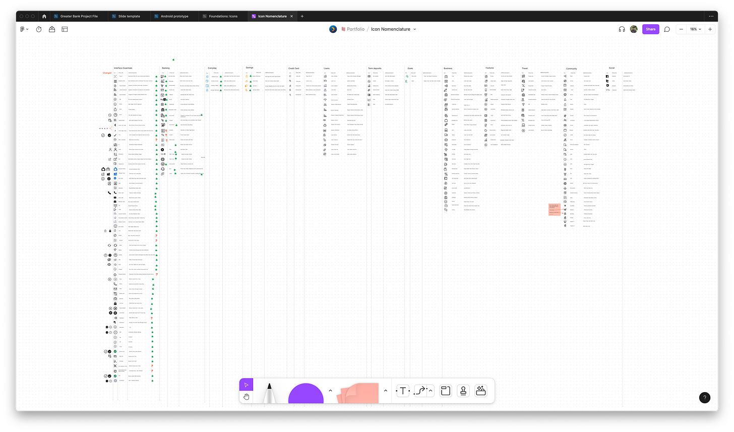
While our content designer would add new names and metadata to the icons. We decided to capture this all in a Figjam.
After auditing all the icons and adding all the metadata, we did a review with the team. All positive feedback from the session let us know we were on the right track.
The next step is the tedious process of going through every icon in our Figma UI Kit. While going through this process, I wanted to do a few other things:
Make sure icons scaled.
Clean up layers (remove any redundant groups).
Add icons to a base frame size of 24x24px.
Making sure icons scale
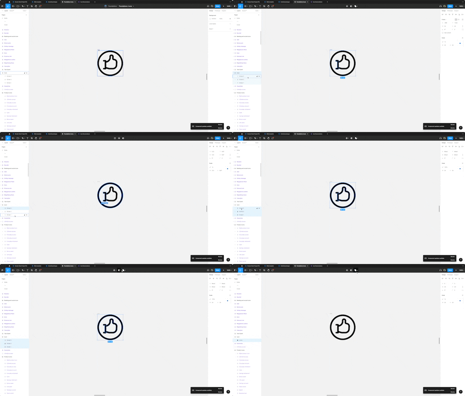
Once I had removed and replaced all icons, it was time to make sure they scaled. I tested this by placing each icon on a frame 24x24. Then, pressing the scale shortcut "K", make the icon larger.
Some paths weren't grouped together when resizing the icon. For example, if the stroke weight stays the same, it means strokes move independently. I fixed this by selecting all the stroke paths and unionising them.
As a note, some icons have crazy paths, and it can take some tinkering to make sure they scale correctly. Try unionising the strokes or even outlining strokes.
Choosing an icon scale
When designing, it's best practice to have a spacing scale. A typical example would be (4,8,12,16,32, and so on). This ensures visually consistent designs.
For icons, you can also have a scale. This will allow you to identify all the sizes you wish to accommodate and create a common language if you share the scale with your developers.
Us, we decided on this scale:
Very small 8x8 (Absolute smallest size, any smaller icons become unrecognisable)
Small 16x16
Medium 24x24 (default and most common)
Large 32x32
Extra Large 48x48
Before Figma introduced its new component properties, I created a custom component with variants based on that scale.
So designers would just drop in an icon frame, set its size and change the icon instance from inside.
Further exploration would be needed to see if the new component properties are better.
Small observation
While going through this work, I noticed most of our icons were using a Primary blue from our colour palette. However, icons from the UI Kit had a base colour set to Black.
This meant when designers implemented any icon into their own files, they would manually have to change the colour. I fixed this by setting the base colour of our icons to Primary blue in the Icon kit.
Creating subgroups
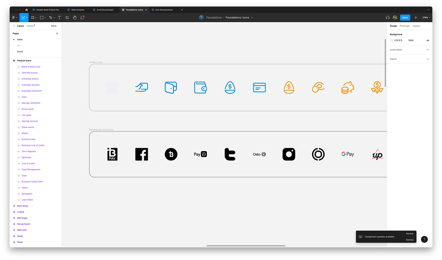
Our icons weren't just general interface icons. We use some for specific products that have particular colours associated with them.
To ensure we preserved these icons, I created a frame and placed the icons inside. Then, when searching through the icons, this frame would become a folder, ensuring they were contained and still discoverable.
Final product
Once finished, we presented our project to the team, demoing how to use the new icons and the icon frame component.
Now people can search our icon kit more easily since we’re supporting a more comprehensive range of associated words (metadata).
After moderating the changes, overall, it's been well received. The following steps are to explore creating and automating design tokens for the icons and getting them into code.
Thanks for reading. If you have any questions or feedback, feel free to reach out.


